
This blog is now closed.
Frank Tan - Student No. 3795
Friday 16 December 2011
Note to the Moderator
First of all, thank you for taking the time to look at my blog. I've spent a lot of time trying to finish it and I hope I've done well. I'm definitely pleased with what I've accomplished and I hope you have as well.
My blog is linked to the group blog, as well as everyone in my group's and the class blog (Latymer Music Video). The links are on the side bar at the right, with the link to the group blog at the top.
Contained on my individual blog is all my personal research, initial ideas and planning prior to our decision on which idea to continue on with. Also included is the album cover, link to the website and answers to the evaluation.
The group blog contains evidence of group research, planning and production, showing development of our initial idea to our final idea and the inspirations that influenced our work. Our final music video is at the top of the blog.
I do hope that you find it relatively easy to navigate my personal blog, and that it isn't too boring for a subject as creative as Media. My blog is organised in reverse order, so the most recent work (December 2011) is at the top while the oldest (June 2011) is at the bottom, however, evaluation questions run from 1-4 down the page. All the posts have been labelled for easy identification, whether it be research, planning, production or evaluation. These same labels are applied to the group blog. My individual contributions are labelled as such on the group blog.
Wednesday 7 December 2011
Evaluation Question 1 - In what ways does your media product use, develop or challenge forms and conventions of real media products?
Our media product uses several conventions of its genre, as well as challenging common representations of women. We construct this through our costume design, character personality, use of theory to develop our video and so on. Particularly influential to our designs were The Pretty Reckless and Paramore. Completely unintentionally, we shared some of the ideas from one of Paramore's music videos 'Playing God', which we only found out after completing our own video.
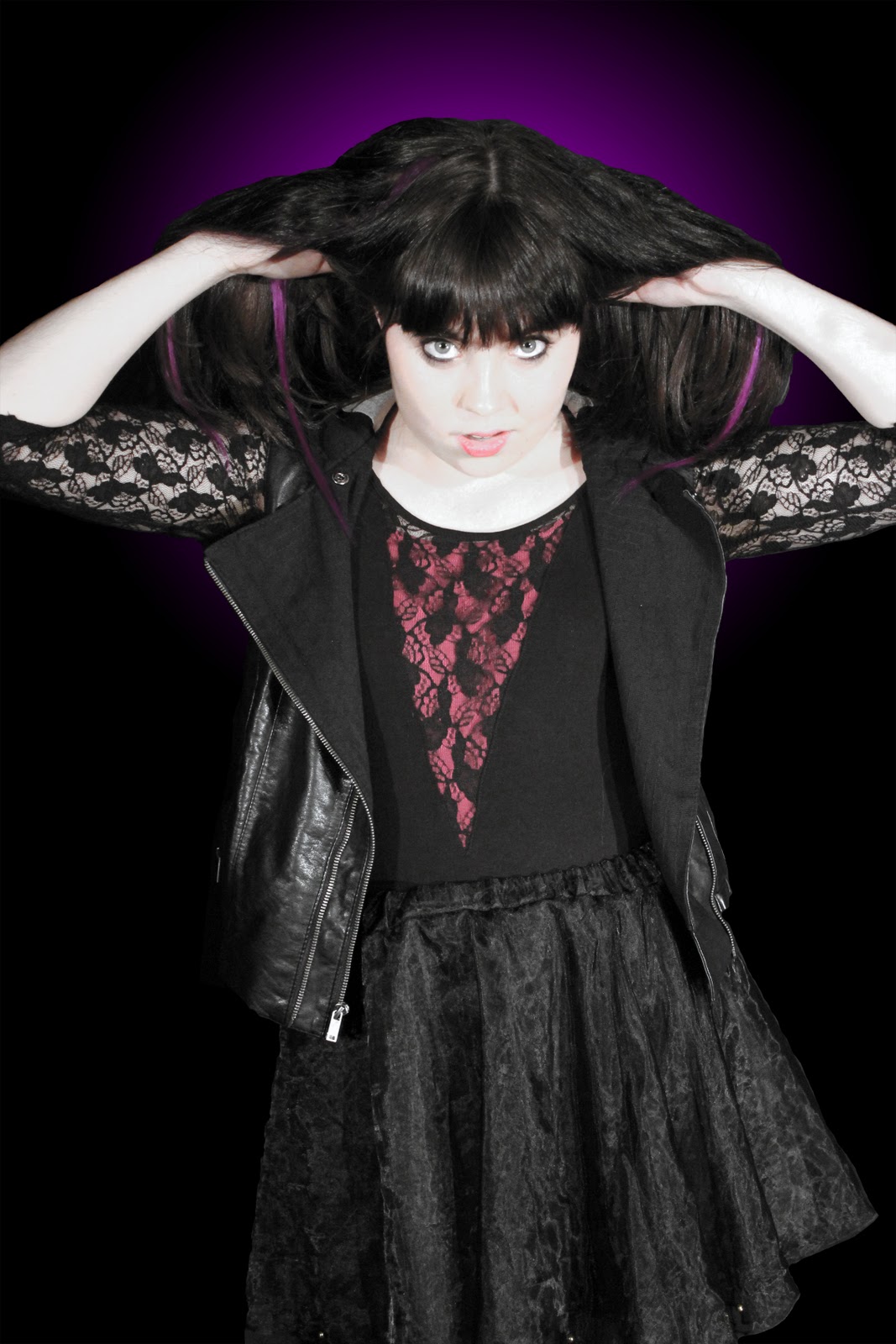
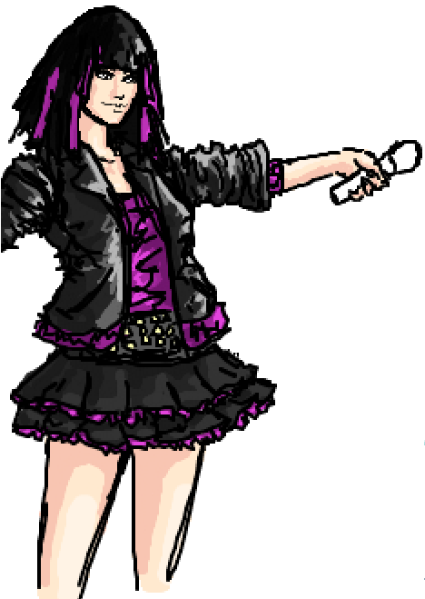
Our costumes were designed by me. From the very beginning, as soon as we had decided on our song and that our band was going to be fronted by a woman, we knew that we didn't want to present her as slutty or promiscious, and yet we wanted to show her as having beauty and strength. It was our plan to represent our lead singer as a role model/anti-role model for our target audience, someone to look up to as a symbol of female empowerment. I had attempted to design her character as a rebellious role model instead of what many women are represented as in the media; weak or promiscious.
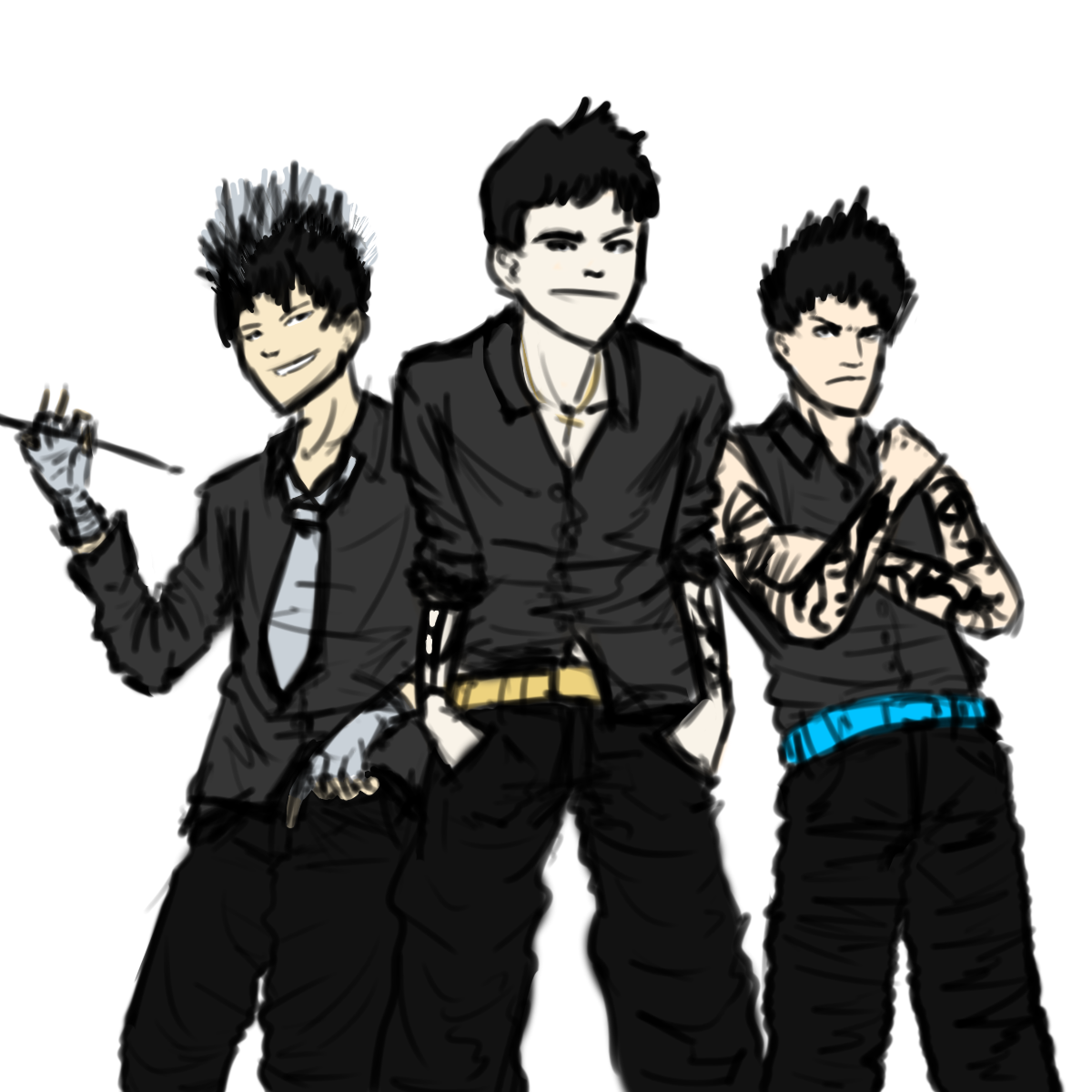
The designs I came up with for the band was more stereotypical for a rock band/rebellious look. When drawing them, each person had a distinct personality. The drummer was supposed to be the cool, suave one, the lead guitarist was supposed to be the handsome, sexy one and the bassist was supposed to be the macho one. The black tied them in with each other and with the singer, as they all wore black, but they all had a colour to differentiate them from each other, for example, the drummer had silver and the guitarist had gold. Due to actor concerns, two out of our three male band members had to be replaced. The bassist was replaced by myself and the drummer was replaced by a friend (Ming) who was willing to help.


The final character representation was different from what I had designed, due to the inate differences in personality. It would have been too forced, as Ming is too bubbly and happy to be suave and I just don't fit the macho mold. We instead created new personalities to fit our characters. I became the enigmatic Xen, supposedly an alien from another planet who simply appeared one day and Ming became the hyperactive, always happy drummer of the band.
We have also used media theory to good use, using Vernallis and Goodwin within our video, which is discussed below.
Following is many of the main points of the video summarised for question 1.

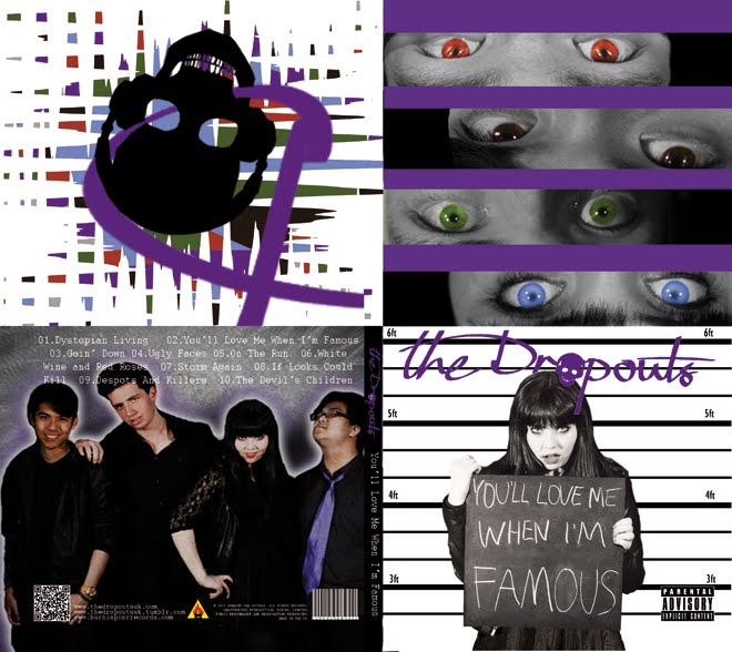
Here follows an analysis of the album cover.
Thus, as you have seen, my media product uses, develops and occasionally challenges forms and conventions of real media products.
Evaluation Question 2 - How effective is the combination of your main product and ancillary texts?
How effective is the combination of your main product and ancillary texts?
Our music video (main product), album cover and website all (ancillary) tie into each other effectively, creating a suitable band identity. We have used a multitude of techniques to help brand the band, for example, themes, colours, costumes, logos, etc. Through this, we have created synergy between our products.
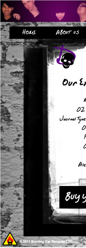
The theme of our products is rock and this is reflected in the music genre, which is rock, bordering on punk. Our music video follows many rock video conventions, such as extended focus on instruments and spotlighted high contrast lighting. Our album cover follows the conventions by having our song list grouped together in a block, as well as having a high contrast black and white front cover. Finally, our website ties it all together with a grungy, dirty brick wall background and a handwritten font for the adverts etc.
Further cementing the band identity are the colours. The overarching colour for the whole band is a deep, rich shade of purple, not too girly, but pretty strong and individual in its own right. The colour purple is presented in the album cover and website, mostly with the skull logo.

Purple is also the colour of Pandora, which signifies her as the lead singer, as purple is the most prevalent colour on everything. Aside from purple, we have three other colours to identify the other band members. Blue for Xen, Gold for Vyper and Silver for Sparks. These colours are shown on the website, on their individual biographies, as well as in the music video (though these are hard to see).

The band colours of black, white and purple are present throughout all our products. For the music video, black is the main costume colour, while we use white during the more 'innocent' scenes. On the website, the background is black and white, while purple streaks the page with text and titles. Our album cover has the same purple as the website and music video for the band name, while black and white feature strongly throughout the whole cover, especially on the front cover and back cover. Purple bars lie on the inside cover to tie the eyes together with the band.
Our website also helps to tie together all the products as well. The website has institutional and branding, for example, the Burning Car Records logo and theDropouts logo as well, as well as theDropouts skull on every page. There are also adverts for the album on almost every page and a large banner at the top of the page.

Also tying together the products is the music player on the website, which plays Goin' Down automatically, allowing fans to listen to the music without charge. In addition, there are links to the Twitter, Facebook and Tumblr of the band.

On the news page, there is also a live feed of the band's twitter page, allowing for fans to join the conversation, connecting the institutional aspects of the band on the internet.
We have also used the band logo (the skull) and the record label logo in our two ancillary texts, to create a furthur institutional identity. We had planned out a whole marketing scheme in order to promote the music video, using the website as a hub and the album cover as a teaser. On our website, we have a competition in partnership with Monster energy drink (Hansen Natural).
 I decided to use Monster because it was less popular than something like Coca-Cola and more likely to be drunk by our target audience. It was incredibly unlikely that we would be able to get a partnership with Coca-Cola for a competition, even for an imaginary band, which is why Monster was my choice of beverage.

In the music video, the skull logo is taped to the bass drum, though it is only visible in a few shots. On the website, it is on the top left of every page, while the record label is on the bottom left and a link to the record website on the top banner.

Our band costumes also play a strong part in creating synergy between our products. The band members wear the same costume on the back cover of the album as they do in the music video, as well as in the photoshoot, which is shown on the gallery of the website. Their similar, yet unique outfits both group them together and set them apart, creating an identity that is both branded and individual.
Evaluation Question 3 - What have you learned from your audience feedback?
Our primary target audience is 13-20 year old females and fans of the genre. Our secondary target audiences are teenage males aged 13-20, young females aged 10-13 and young adult females aged 20-25. After finished our music video, we got together a focus group to watch it and give us feedback, filling in a questionnaire that we made.
After being shown the video and filling in the questionnaire, we compiled the answers and the common consensus was as follows. Most people enjoyed the intro to our video, with the fast paced cutting between the drums and band members. They liked the various set ups and they also like the slow motion falling shot. They also liked the final quick cut sequence at the end. On the other hand, many also felt that there wasn't enough energy in the video and that a lot of sections were too static, that the angles could be more outlandish, as they were mostly straight on. They also felt that the lighting needed to be better with more contrast between different shots and that the story was somewhat unclear.

We also created an online questionnaire to distribute to our target audience via social networking sites like Facebook and Twitter. Above are some of the answers we received and many of the criticisms that were brought up in our focus group are present here as well.
So what I have learned from this feedback is never to use a static shot when filming a music video, as it creates a significant lack of energy within the video. I had noticed the lack of energy in the first filming session, as we had used numerous master shots for our seance/coffin shots. Once we had captured them and edited them into a coherent sequence, it was immediately noticeable that there was a lack of energy in the sequence. What had been planned was that the actor would make up for the static shot with more energy, but this did not work, because the actors simply could not create an energetic shot on their own. In later filming sessions, we added a circling shot to many of the set ups, but this still wasn't entirely energetic enough, which lead to the criticisms from our audience.
I also learned that music videos generally need to have the story fairly obvious in order for the audience to understand it. Our music video has various set ups that are designed to represent the different parts of the story, but because of the nature of music videos, they are split apart and generally cannot be pieced together in a coherent manner. It will flow, but not fluidly. Thus, a music video must be more obvious, the story must be more explicit than implicit, otherwise the audience will find it hard to understand.
Overall, we received a rating of 7.7 from our target audience, both males and females, mostly aged 17-18, but a few younger ones as well. This shows that we have mostly succeeded in our targeting of them as our audience, as they found the music video enjoyable and quite a few said that they would contemplate purchasing the album.
Evaluation Question 4 - How did you use new media technologies in the construction and research, planning and evaluation stages?
New media technologies have been used in all of our processes; planning, production and post production. We have used technologies such as Web 2.0 in our web design, marketing and audience feedback, as well as lighting and sound tech in the studio we filmed in.
While planning, I drew the character designs that would eventually come to life on screen. For the initial design of Pandora, the lead singer, I used iScribble, a multi user online real time drawing website. This allowed me to get feedback from my fellow artists before finalising the design. Already, I was able to start shaping the designs towards our target audience, as many of the users of iScribble are females aged 13-20, with the other users being males of the same age range.

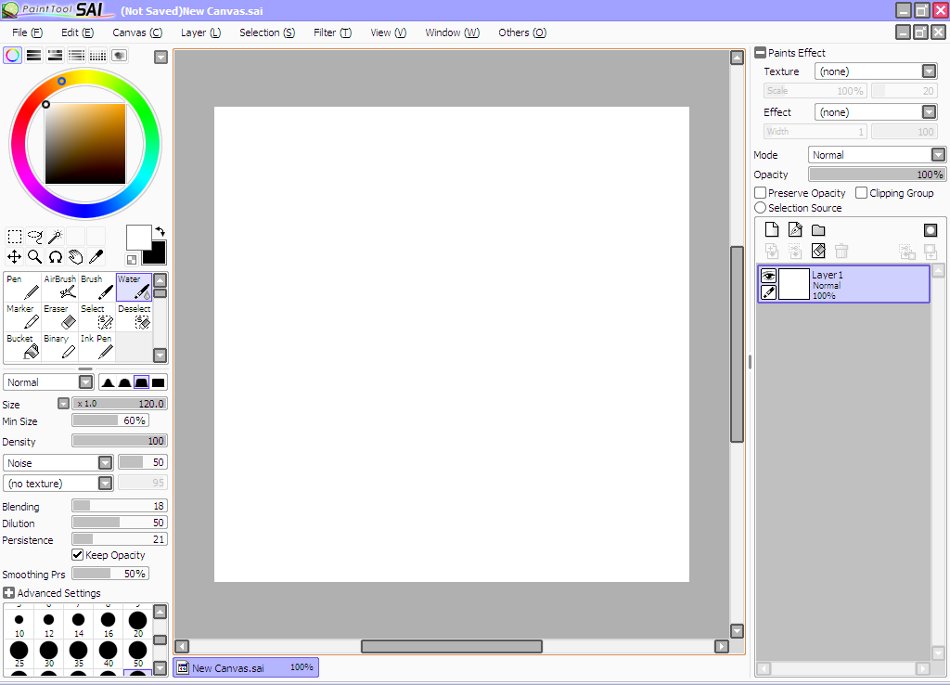
For the character designs of the other three band members, I used Paint Tool SAI, an extremely easy to use drawing program, along side my drawing tablet, a Promethean ActivTablet, which uses Wacom technology to operate (i.e, a magnet in the tip to influence the position of the cursor). This allowed for a more precise drawing, although since it was an initial design, I didn't clean up the left over lines, which lead to the messy half finished look. Despite this, it worked well as a design and although our final costume didn't end up looking like it due to actor changes, it paved the way towards the final design.

Here is the finished website. We created this website with WIX, a free Flash website creator. Initially, using this website was somewhat challenging, due to the nature of master pages and trying to place pictures so that they didn't show up on every page. Eventually, I mastered the interface and was editing the website with ease, adding twitter feeds and galleries. We have linked to most of the popular social networking sites, such as Facebook, Twitter and Tumblr. With the prevalence of smartphones in modern society, we have also created a mobile website.

On the topic of galleries, every shot in our gallery was edited in Adobe Photoshop CS5. Since we were shooting on a black background, and our actors were also wearing black, it caused us no end of trouble attempting to isolate them from the black. We managed to cut them out using the polygonal lasso and fix it up with the eraser. One of the more recent additions to Photoshop is the ContentAware function, which takes information from the image to fix a spot with the spot healing tool, for example, a blemish or something that needs to be fixed. It was essential to the quality of our edited photos and is very useful.


When editing our video, we used Adobe Premiere Pro CS5 to do so. This was an upgrade from my AS project, with which we used CS3. CS5 has a new additional features to CS3, but is overall the same. Despite this, it seems to run faster and has the option to stream HD video while capturing, which was nice, as we got to review our footage before we started editing it, meaning that we had some time to plan how it was going to come together. This is notable as HD video isn't usually viewable while capturing.
 |
| James our cameraman! |
Our music video was filmed entirely on a Sony HVR V1E HD camera. When filming, there was a manual focus instead of an automatic focus (this was an option, but we decided to use the manual for focus pulls). When I was filming the circling seance shot, I had trouble keeping the camera focused and stable, especially when I started changing levels, from high to low. Despite this, quite a few of the seance shots were used in the final video, because they were quite energetic compared to shots from the same session.

For our audience feedback, we created both a focus group to show the video on the projector and an online survey to gather audience feedback from a more global standpoint. With the increased usage of internet over the years, clicking the link to a survey and filling it in takes no longer than 5 minutes, which allows us to gather data quicker and more efficiently than previously.
Also used was the increasingly popular Twitter website, on which I posted the link to the music video and the online survey above. The trending nature of Twitter will allow for a viral transmission of our music video around the internet, leading to a huge amount of word of mouth and thus, succeeding in a viral marketing campaign.

Thursday 13 October 2011
Potential Logo Design

That vector better have been worth the effort.
Friday 7 October 2011
Band Names and Album Tracks / Group Meeting 2
Today, we gathered and went over the necessary items for the pitch. Of the five, we only need to work on our band identity/marketing more. We also started to think up names for our band, as follows:
- The Dropouts
- Melted Sin
- The Beautiful Damned
"You'll Love Me When I'm Famous", published by Burning Car Records (personally I think Entertainment works better here).
Our song list is as follows:
- Dystopian Living (I prefer Dystopian Future)
- You'll Love Me When I'm Famous
- Goin' Down
- Ugly Faces
- On The Run
- White Wine and Red Roses
- When The Wind Blows From The East, Cut Down The Willow Tree ft. Slash
- If Looks Could Kill
- Despots And Killers ft. Billy Joe Armstrong
- The Devil Made Us His Children (subject to change)
Thursday 6 October 2011
Music Video Treatment
Olivia, James, Frank Treatment
Essentially, this is a summary of the previous posts.
Tuesday 4 October 2011
More costume design
| |
| Dito, Ben and Ethan/me |
In the context of costume design, we decided to give each band member their own colour. Olivia gets purple, Dito gets silver, Ben gets gold and Ethan gets a nice neon blue. These outfits are designed to look smart, cool and sexy all at the same time.
Group meeting one
Agenda:
To finalise the idea for our music video, alter any parts that are impractical and decide on the final cast, costumes, locations and props ready for us to pitch our idea.
Final Idea
The final idea for our music video is very similar to our initial idea. However, some of the features have been slightly edited to make them more practical. The performance aspect of the video has mostly stayed the same, with the idea of the band playing in a dark room with spotlights to show the isolation and to reinforce the idea of her confessing and being locked up.
Our idea for the ending has now been changed, as instead of showing the singer alone in the darkness, we will now show the singer blowing out the candles in the dark room, causing a blackout. We felt this ending was much more ambiguous and would therefore work better.
The narrative has also mostly stayed the same, although now in consideration of time and practicalities the flashback during the middle bridge will be done in a 'Sin City' style, with the shots being in black and white but with some colours showing through. Instead of a fairground we are thinking of maybe just using a park as it would be easier to access and film in.
We are still hoping to do the 'drawn animation' idea, which will mean we won't need an actual location as we can draw that into the background when editing.
Locations
- Studio / Dark Room - Band performance area
- Wooded area - Grave scene
- Park / Fairground & Bedroom - Flashback
- Plain room - Possible animation for flashback
Actors
- Singer - Olivia Cole
- Guitar - Ben Steyn
- Drums - Dito Widjono
- Bass - Ethan Carter / Frank Tan
 |
| Olivia Cole |
 |
| Ben Steyn |
 |
| Ethan Carter |
 |
| Dito Widjono |
- Boyfriend - James Reader
- Cheating Girl - TBC
Props
- Candles & Candle Stand
- Instruments
- Spade
- Photos of Girl + Boy
- Smashable / Burnable objects
Costumes
- Band costumes
- Boy's / other Girl's outfits
- Singer's 'normal' clothes
Monday 26 September 2011
Reflections on 1D website
Advertising.
What is it all? It's 360 degree marketing, highly orchestrated to promote the image that the record label wants. It's a contemporary advertising campaign, driven by Web 2.0 for a predefined target market, in this case, 7-14 year old girls primarily. Syco Music has designed the website to be the home hub for all of One Direction's advertising.
Advertising starts with constructing a brand. In One Direction's case, by running off the back of X-Factor losers, they gained a lot of public goodwill, which mean that the public was very accepting of the group already. It also provided a stable base for the marketing team to build on. One Direction is a group of 5 boys who can sing well, but not outstandingly. They have pretty faces, but are marketed to be innocent, naive, all of the advertising is designed to show One Direction as this sort of summer camp love interest.
The end result of all this advertising is supposed to be profit. In our jobs as the record label for a new upcoming band, we have to shift our band's product to gain money. We have to sell the album, single, as well as the video and tour tickets.
We can do this through the more contemporary online marketing campaign, through which we could create a viral network via YouTube videos, Facebook or Twitter. We could create a website from which all news and fan interactions could take place. We could create a store with which to sell merchandise such as clothes, or accessories like mugs, calenders or posters. We could even create an iPhone or Android app to promote our band.
Alternatively, we could advertise our artist via endorsements, for example, One Direction endorses Nokia phones, with a new 1D Nokia C3 and C202 phones coming out soon, as well as Twitter endorsements via Ollie Murs, who comments on 1D. As it happens, Ollie Murs' record label is owned by Sony, as is Syco. Finally, we could go with the traditional broadcast media. That is, magazine interviews, TV spots, radio advertisements, billboard posters and bus stop posters, etc.
One Direction's advertising campaign is pluralistic. This means that aside from their main target market, they are also targeting a secondary and possibly even a tertiary market. The secondary would be older girls, teenagers aged 14-20. The tertiary would be the primary market's parents. They have to like the product for them to buy it. If they find the boys appealing, then they are much more likely to buy an album or a single for their children. They may even like the band themselves, buying the single because they like 1D as well. It's all a cunning plan to sell as much product as possible.
One Direction website research
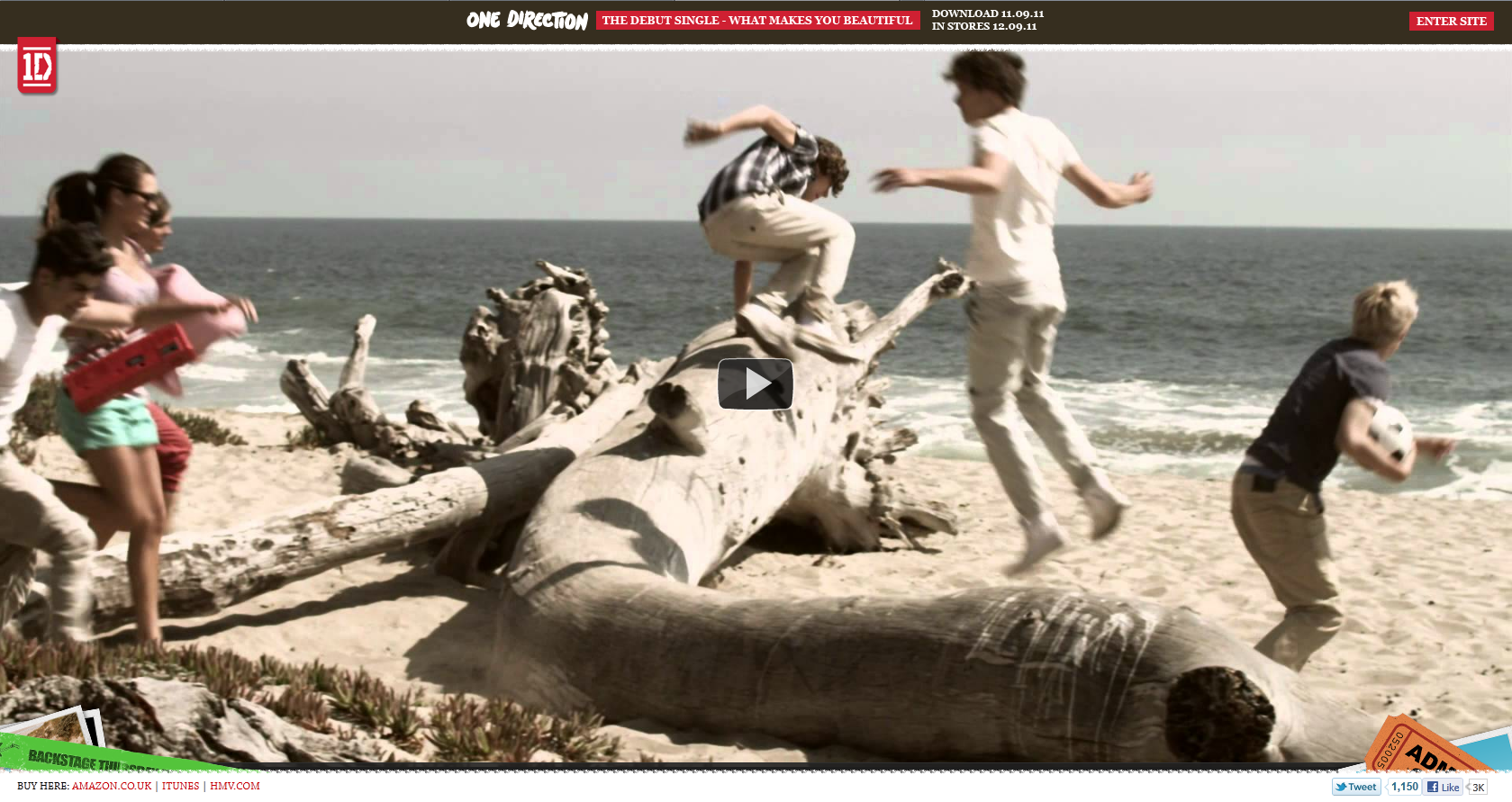
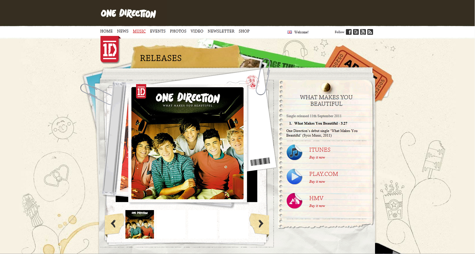
The One Direction website is a giant host of advertising and interactivity. Even on the first page, before you get access to the main website, there is a giant embedded YouTube video of their debut single, designed to advertise the music and interest people, with 3 links to purchase the single at the bottom, whether at Amazon, HMV or iTunes.
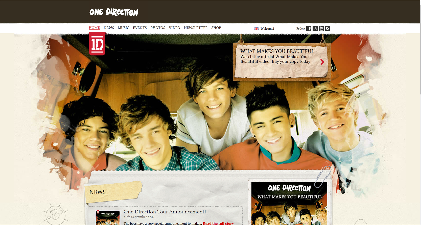
On the main page, you are immediately greeted by a giant splash image of the 5 members, as well as another link to purchase the single overlayed on top, ensuring that someone will purchase it, as the splash is the first thing to catch your attention. Right above that is a link to connect with the respective Facebook, Twitter and YouTube pages, creating a wide network with which to advertise with.
Even on the news page is an item dedicated to selling the group; personalised gift prints, messages to send in their handwriting. There is information on the tour dates, as well as competitions to win a copy of One Direction's book, as well as a video of their reflections of the book signing.
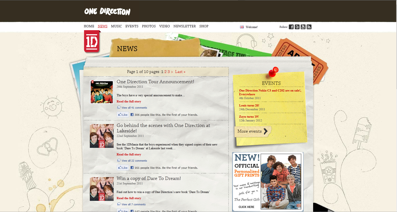
On the music page, there are yet more links to purchasing pages, with the same image as on the main page greeting you. Many followers may buy the single just to see their faces every time. Already, the website is being consistently branded, with 'One Direction' emblazoned across the header and the logo always in the top left corner of the screen.
On the sidebar to the right, there are also Facebook and Twitter comment boxes, which allows the target audience to interact with the website and thus give them a more vested commitment to the website.
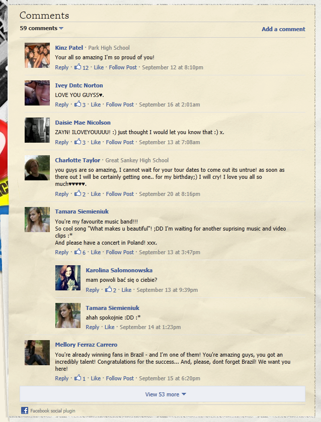
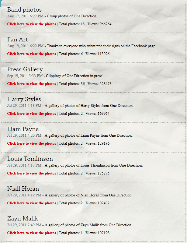
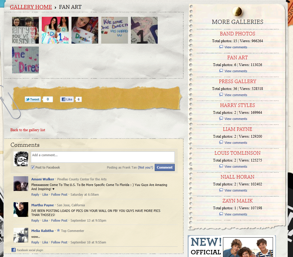
Also on the website are photo and video pages, on which you can post comments from Facebook. There are also fanart pages, where fans can post their photos that express their deep passion for One Direction.
Even on the news page is an item dedicated to selling the group; personalised gift prints, messages to send in their handwriting. There is information on the tour dates, as well as competitions to win a copy of One Direction's book, as well as a video of their reflections of the book signing.
On the sidebar to the right, there are also Facebook and Twitter comment boxes, which allows the target audience to interact with the website and thus give them a more vested commitment to the website.
Also on the website are photo and video pages, on which you can post comments from Facebook. There are also fanart pages, where fans can post their photos that express their deep passion for One Direction.
Thursday 22 September 2011
Intertextuality in Music Videos
Busted - Year 3000
There are a lot of intertextual references in Year 3000, most notably is a reference to Back To The Future, with a time machine (a souped up car, ala the DeLorean from the film).

A 'flux capacitor' is mentioned, referencing the film directly, with the neighbour resembling the Professor as well (albeit a child). At the very beginning is a reference to the old Amiga 3000 game console, with the ancient graphics and shooting of pale green aliens (Alien Invader). When showing the 'triple-breasted women', it's both a reference to Total Recall, which features a triple breasted stripper in the bar, as well as the ancient sci-fi show convention of having triple-breasted women as aliens, which is one of the oldest clichés in science fiction.

The location of an underwater city with animated creatures swimming around seems to reference Spongebob Squarepants. The animation style also seems to resemble Futurama (this resemblance is strengthed by the 'Big Dan's Calimari' ship, which looks like the Planet Express ship). It offers an interesting insight into what the future might be like, which is nothing like what old sci-fi novels represent the future as, all robots and machinery.

Busted are also unafraid of creating irony with themselves, showing a backstage room with a Busted sign and 3 stars on it, containing the extremely aged version of themselves, suggesting that they are an ancient cash cow.
Wednesday 21 September 2011
Music and Me: Reflections
During class, we discussed our song choices posted on our blogs in great detail. For example, who we chose, why we chose them and what we might choose in the future. During childhood, many of us shared similar tastes in music, many people enjoyed listening to Busted or the Spice Girls. There was a sense of going along with the crowd, because it was what everyone else listened to. There was a sense of fitting in and it gave you something to talk about in school. On many occasions, music tastes were heavily influenced by parents or older siblings, who were often the ones to introduce them to the music. These bands were absolutely everywhere; played over the radio, on CDs bought by parents/blasted out by siblings on hi-fis, on posters at bus stops, it's no wonder our song choices are mostly mainstream pop bands. It was a musical sensation and almost a complete monopoly on the market. I can't remember many bands from the 90s except the major groups like S Club 7 or Steps, which shows how effective their marketing was. It was camp, it was upbeat, it was peppy and quite honestly, it was absolutely brilliant. Any child in that time would have been absolutely enthralled by the music and the dancing.
Steps - Last Thing On My Mind
It was when we entered secondary school (or thereabouts) that we start to stray away from the mainstream hits and start to form our own music tastes, exploring the wide world for different genres. Around the same time, the iPod was invented. Suddenly, music became portable. You could bring an iPod into school and show your friends the coolest new song and just like that, music became viral. Bands that children had never heard of before could be listened to just by someone bringing over their iPod for you to listen to. This meant that musical taste was no longer just browsing through the vinyl records or CD section of HMV, it was whoever had a computer with enough space to store their music and enough money to afford an iPod.

Children nowadays have almost instant access to any kind of music they want through websites like YouTube, or applications such as Spotify and iTunes. I suspect that music will become progressively more available for younger generations as technology continues to improve and become easier to use. With shows like X Factor, or Pop Idol, people can go from unknown to pop sensation overnight, with YouTube videos being linked everywhere over Facebook and Twitter (as with Justin Bieber). A potential problem with these 'overnight sensations' is that real talent starts to disappear, as these people with good marketing teams start to gain a monopoly on the music world. It's amazing what a handsome boy with a few beauty shots will to do the average teenage female.

Monday 19 September 2011
Costume design
Friday 16 September 2011
Music Video idea for Goin' Down
My idea is that for the first verse, she could be being interrogated by police in the station (or turning herself in by going up to patrol officers). But instead of telling them upfront, she could be flirting with them all the way through, showing that she still has power over them.
When it goes to "There was this boy", we could cut to the Epping forest shot of her dragging a body along (panning through trees optional). Then we cut to her tracing his face with a hand sensually, with a manic smile on her face. Then at "eight feet underground", we shovel some dirt onto the camera.
When it goes to the chorus, we cut to her being locked up in prison, with the band playing behind her. I think it would be most effective if we have a lot of jump cuts in time where she keeps moving around the room making crazy actions and random twirls.
If we keep the second verse, we keep up the flirting, like, shoving the officer against a wall and straddling him with a leg maybe, then pushing him away laughing. Anything to play with his mind, to show that she's manipulative or crazy.
When it gets to the second chorus, I was thinking that we could go to a scene where it's her and her boyfriend before the affair, like, they're having fun outside or something, maybe at a funfair? But there should be little hints that he's not as faithful as he should be, like maybe checking out some girls walking down the street.
Then when it gets to the softer part, we should cut to a late night, she's been out working (or partying), she comes home and goes upstairs to find her boyfriend with another girl (taking that line literally). We *have* to do the cliché sheet grab thing. We could cut to her attacking him with a steak knife or we could just cut back to Epping forest, where she throws a cigarette (or a spade, I'd prefer the spade) on top of the camera.
At "And now there's no one left", we could show her sitting at home against a wall, knees to chin and staring at a photo of them together, which would probably involve her smiling a lot and him with his head in the space between her shoulder and neck and trying to kiss him. After the pause from "Drag", it should cut back to her at the police station, acting a lot more violently and crying. In the silence that follows, we see her walking out of the police station completely unhindered. This whole section is supposed to show that she's remorseful for her actions. Or is she?
Because the very next chorus, we have, you guessed it, her by a burning car and singing out the remainder of the song with the band and she would be acting exactly as crazy as she's shown to be inside the jail cell.
Problems:
-Burning car.
-Police office (possibly someone's study? We need blank walls and a simple desk). -Jail cell (bars? Would Edmonton Police Station let us film in there? If not, we could get the Seward Studio and repurpose it?).
-Lipsyncing the song (maybe her lipsyncing the song all the way through would suggest that she's insane? You know that stereotype that insane people speak to themselves? Maybe everyone hears this song as the ramblings of an insane woman?)
These are my thoughts, I think it would be interesting, but perhaps too story driven. But it would be an idea, definitely. Not sure if Ms. B will like it. Not sure if you guys would like it either. I flicked between down here and about the Seward Studio, I think we could do a lot of stuff in there if we made it look right. Anyway, I'm done.
Tuesday 13 September 2011
Joseph Hahn - Music Video Director

Joseph Hahn (March 15th, 1977) is better known by his stage name of Mr. Hahn, best known as DJ and sampler for the rock band Linkin Park. He has also directed every single Linkin Park music video to date. In a 2003 interview with MTV, he called film-making his true passion, music was just something that came with the job. Aside from working with Linkin Park, he has also directed music videos for Story Of The Year, Xzibit and Alkaline Trio. He has also directed the trailer for the video game Medal Of Honor (2010), which featured the first single of Linkin Park's newest album, The Catalyst (the album is called A Thousand Suns).
Music Videos
Linkin Park:
One Step Closer
Papercut
In the End
Pts.OF.Athrty
Somewhere I Belong
From the Inside
Breaking the Habit
Numb
Leave Out All the Rest
Bleed It Out
Shadow of the Day
What I've Done
New Divide
The Catalyst
Burning in the Skies
Waiting for the End
Iridescent
Wretches and Kings
Common themes
Many of Hahn's videos are performance based concept videos. Notable concept videos are In The End, Papercut and Breaking The Habit (which I touched upon earlier in the blog). All of Linkin Park's videos have been directed by him, which causes them to share similar themes, such as paranoia and a sense of starting anew.
His videos feature quite a lot of CGI, most notably the remix of Points of Authority, which consists of a full CGI battle between robots and aliens, the robots headed by the 6 heads of Linkin Park members. In The End has a giant sky whale, with an entire barren landscape turning into a lush forest in minutes. Breaking The Habit is entirely animated like a Japanese Animé.
Friday 9 September 2011
Potential Music Videos to cover
Today, we agreed on the first members of our group, me, James Reader and Olivia Cole. This is still subject to change, but we have no problem accepting another member. We also went through some songs and we (or rather, Olivia) decided on our band type, which is to be a girl rock band (a rock band with a female lead, as opposed to a full female band).
Goin' Down - The Pretty Reckless
This is a nice angry song to burn a car to. Our idea is one of a rebellious teenage girl and this song is very punk, it's very fitting for our needs. However, one of our concerns is that the references to the Catholic Church could be offensive. In my opinion, if we're going to burn an old car, we might as well go the full mile and rebel against the church. The song is about murdering a lover after he cheated on you though, the church just happens to feature.
My Medicine - The Pretty Reckless
This song is a lot slower than the last one. It has a different effect. This one is a lot more sluggish. It gives me the feel of a hazy back room in a bar, with smoke whirling around in the air. I'm not sure if it's angry enough for what we want, but I can definitely see us using this to play with mental conditions.
Hit Me With Your Best Shot - Pat Benatar
Now, this song is a lot less angry and a lot less punky. It makes sense given that it's an 80s song. This song was for a slightly different idea than the one we had. There was a plan to shoot a music video for this at Alexandra Palace skate park, due to its graffiti. Something about tying me up to a chair and pushing me over. It was a lot more light hearted than my current thoughts on the rebellious girl.
That said, these songs are still subject to change. We still have to go through a lot more girl rock bands and we might find one that fits our needs better.
Wednesday 7 September 2011
What Music means to me
Children - Robert Miles
This track was what got me into the dream trance genre. When I was about 7 or 8, I spent a lot of my time on the computer while listening to this track. I feel as though this track defines my childhood because of its constant beat. There are many different threads in this track, they all go in different directions, but the beat is always there, keeping it on track, binding it together into a coherent piece of music. I can apply that to my childhood, as I always to slack off, but my Mum would keep me working so that I'd do well in school. I appreciate the efforts now.
Somewhere I belong - Linkin Park
This song reflects my early teenage life. I felt really lonely because I was so socially awkward (and still am). I didn't feel like a part of any group so I was on my own for most of my time. I'm sure that there were attempts to befriend me but I didn't understand how the friendship dynamic worked and I just felt that no one liked the stuff I did or understood why I was how I was. I wanted to find my place in society. This song describes my desire perfectly. It was also one of the first ever Linkin Park songs I listened to. My friend brought over the Meteora CD one day and I was hooked instantly.
Firework - Katy Perry
Firework is a song that I feel reflects my life currently. I feel as useless and lonely as I did in my young teens, but now I have a glimmer of hope, mostly provided by my art and my friends. There's a future in sight for me now and everything is slowly coming together. If I can put my talents to good use, then I'll never want for use again. One of the problems I have right now that the song covers is my lack of self confidence. I don't think I'm good at anything, it's especially hard when my Mum keeps comparing me to people who work harder than I do, or people who just have more talent than I. It's kind of depressing, but I just have to keep my spirits up.
Album cover research
Linkin Park album covers are always interesting. The band is well known for its nu-metal and alternative rock songs. Their style of music is suggested through the album covers, for example, the first album cover, Hybrid Theory, consists of a soldier with dragonfly wings. The idea behind this was to describe the blending of hard and soft musical elements, contrasting the outstanding red soldier to the delicate, pale wings. The use of spray paint reflects the content of the songs; frayed, uneven and broken, like the themes of isolation, disappointment and relationship failure.


The second album, Reanimation, also has a related cover. The soldier from Hybrid Theory has been replaced by a robotic version that resembles a Mobile Suit Gundam from the Gundam Wing animé that became extremely popular in the U.S prior to the release of the album. The robot has connotations of a remixed album, as the songs are remixed versions of Hybrid Theory songs.


For the Meteora album cover, spray paint is again a common theme. The album contents reflect this, which is perhaps the reason that some critics have called it nothing more than Hybrid Theory part 2. This, however, makes it easier to brand as Linkin Park. They are already well known for their nu-metal/alternative rock songs due to Hybrid Theory, allowing LP to link Meteora back to that via the spray paint. In addition, the man doing the spray painting with a gas mask is a call back to one of the songs from Reanimation; Frgt 10 (Forgotten), the music video of which features a rebellious man spraying the LP logo onto a wall.


On the other hand, while Linkin Park often shows their band members on the cover of their albums, Coldplay is more of a conceptual band than Linkin Park, with their album covers reflecting their alternate nature, despite being classified as the same genre as Linkin Park. Coldplay's first two albums, Parachutes and X&Y have a cryptic album cover, mystifying the listener. The covers raise questions about the band that aren't immediately answered, which interests the listener and persuades them to buy the album to examine the band furthur. While Parachutes has no direct reference to the songs on the album, X&Y is named after the song X&Y on the album. None of Coldplay's albums feature the band on the covers, although Parachutes has the band on the back (albeit very small)


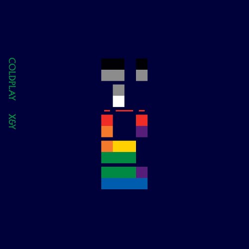


As a whole, album covers are designed to sell the album, to market them to the target audience. They are there to help promote the band image, in Coldplay's case, to promote an image of mystery and indie, in Linkin Park's, to sell the band as punky and edgy. The front cover sells the artist as a whole whereas the back cover is to sell the album itself, as well as having the institutional synergy (i.e, company information, company logo, barcode etc). The back cover also has a song list, with time codes and duration of the song.
Every album cover will have the title of the album, the name of the artist and a unique image to help market it. The size of the font will depend on how well known the artist is, if it's a debut album, the name of the band will overshadow the name of the album, with the band name shrinking in the later albums, as there is less need to emphasis the artist's name. The type of font used will usually reflect the artist's nature, for example, Linkin Park's font is quite grungy earlier on, reflecting the dark themes contained within, whilst Coldplay's font is relatively plain in the earlier albums, but becomes much more extravagent and eccentric in the later albums.
Subscribe to:
Posts (Atom)