BLOGGER TEMPLATES - TWITTER BACKGROUNDS

Music Video

Album Cover

Album Cover

Website

Friday, 16 December 2011

Closing Post

This blog is now closed.

Frank Tan - Student No. 3795

Note to the Moderator

First of all, thank you for taking the time to look at my blog. I've spent a lot of time trying to finish it and I hope I've done well. I'm definitely pleased with what I've accomplished and I hope you have as well.
My blog is linked to the group blog, as well as everyone in my group's and the class blog (Latymer Music Video). The links are on the side bar at the right, with the link to the group blog at the top.

Contained on my individual blog is all my personal research, initial ideas and planning prior to our decision on which idea to continue on with. Also included is the album cover, link to the website and answers to the evaluation.

The group blog contains evidence of group research, planning and production, showing development of our initial idea to our final idea and the inspirations that influenced our work. Our final music video is at the top of the blog.

I do hope that you find it relatively easy to navigate my personal blog, and that it isn't too boring for a subject as creative as Media. My blog is organised in reverse order, so the most recent work (December 2011) is at the top while the oldest (June 2011) is at the bottom, however, evaluation questions run from 1-4 down the page. All the posts have been labelled for easy identification, whether it be research, planning, production or evaluation. These same labels are applied to the group blog. My individual contributions are labelled as such on the group blog.

Wednesday, 7 December 2011

Evaluation Question 1 - In what ways does your media product use, develop or challenge forms and conventions of real media products?

Our media product uses several conventions of its genre, as well as challenging common representations of women. We construct this through our costume design, character personality, use of theory to develop our video and so on. Particularly influential to our designs were The Pretty Reckless and Paramore. Completely unintentionally, we shared some of the ideas from one of Paramore's music videos 'Playing God', which we only found out after completing our own video.


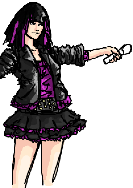
Our costumes were designed by me. From the very beginning, as soon as we had decided on our song and that our band was going to be fronted by a woman, we knew that we didn't want to present her as slutty or promiscious, and yet we wanted to show her as having beauty and strength. It was our plan to represent our lead singer as a role model/anti-role model for our target audience, someone to look up to as a symbol of female empowerment. I had attempted to design her character as a rebellious role model instead of what many women are represented as in the media; weak or promiscious.


The design I came up with was appropriately rock-y/rebellious. The leather jacket is standard for any rock band and it manages to look fashionable instead of just being over the top, with a muted shade of purple trim. I also gave her purple highlights, to both add to the sense of rebelliousness, as many teenagers dye their hair to go against their parents' wishes, as well as joining her up with the band identity, given that purple is the most prevalent colour throughout the band. Her skirt does toe the line between rebellious and over the top, though on the actual costume, the skirt was much longer and not nearly as flared as I had designed it. In the end, our actual costume ended being as rebellious as I had intended, though not quite as 'sexy'.


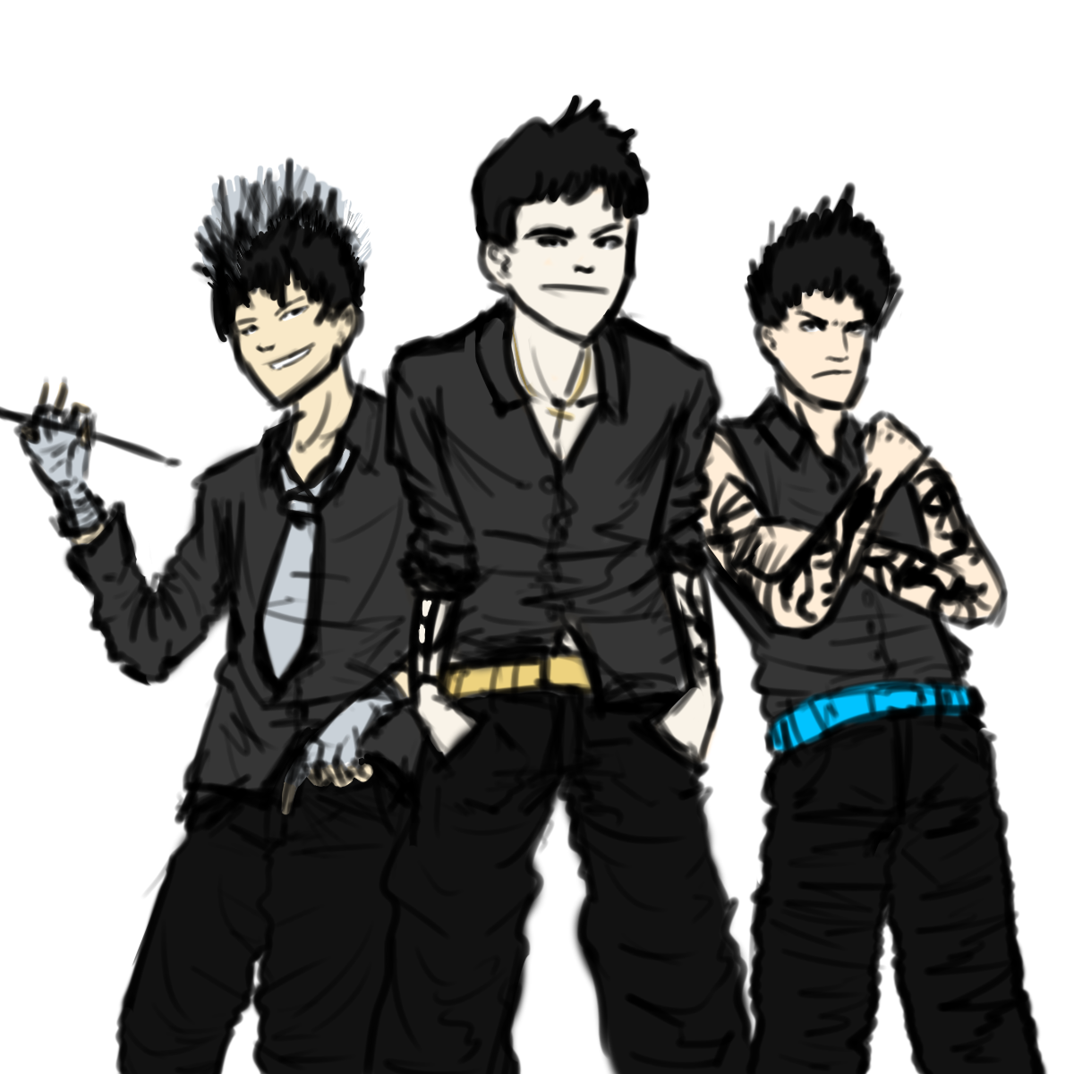
The designs I came up with for the band was more stereotypical for a rock band/rebellious look. When drawing them, each person had a distinct personality. The drummer was supposed to be the cool, suave one, the lead guitarist was supposed to be the handsome, sexy one and the bassist was supposed to be the macho one. The black tied them in with each other and with the singer, as they all wore black, but they all had a colour to differentiate them from each other, for example, the drummer had silver and the guitarist had gold. Due to actor concerns, two out of our three male band members had to be replaced. The bassist was replaced by myself and the drummer was replaced by a friend (Ming) who was willing to help.


The final character representation was different from what I had designed, due to the inate differences in personality. It would have been too forced, as Ming is too bubbly and happy to be suave and I just don't fit the macho mold. We instead created new personalities to fit our characters. I became the enigmatic Xen, supposedly an alien from another planet who simply appeared one day and Ming became the hyperactive, always happy drummer of the band.

We have also used media theory to good use, using Vernallis and Goodwin within our video, which is discussed below.
Following is many of the main points of the video summarised for question 1.


With our album cover, we have conformed to some common conventions of album covers. The type on our back cover is grouped together in one box/not in a list, similar to other rock bands such as Paramore. The convention for rock album covers is to be more out of the box, with a sort of rebellious, 'disregard' the police attitude.


Here follows an analysis of the album cover.

Our website also follows many common conventions of real industry websites. Following is an analysis of the website.


Thus, as you have seen, my media product uses, develops and occasionally challenges forms and conventions of real media products.

Evaluation Question 2 - How effective is the combination of your main product and ancillary texts?

How effective is the combination of your main product and ancillary texts?

Our music video (main product), album cover and website all (ancillary) tie into each other effectively, creating a suitable band identity. We have used a multitude of techniques to help brand the band, for example, themes, colours, costumes, logos, etc. Through this, we have created synergy between our products.

The theme of our products is rock and this is reflected in the music genre, which is rock, bordering on punk. Our music video follows many rock video conventions, such as extended focus on instruments and spotlighted high contrast lighting. Our album cover follows the conventions by having our song list grouped together in a block, as well as having a high contrast black and white front cover. Finally, our website ties it all together with a grungy, dirty brick wall background and a handwritten font for the adverts etc.

Further cementing the band identity are the colours. The overarching colour for the whole band is a deep, rich shade of purple, not too girly, but pretty strong and individual in its own right. The colour purple is presented in the album cover and website, mostly with the skull logo.


Purple is also the colour of Pandora, which signifies her as the lead singer, as purple is the most prevalent colour on everything. Aside from purple, we have three other colours to identify the other band members. Blue for Xen, Gold for Vyper and Silver for Sparks. These colours are shown on the website, on their individual biographies, as well as in the music video (though these are hard to see).


The band colours of black, white and purple are present throughout all our products. For the music video, black is the main costume colour, while we use white during the more 'innocent' scenes. On the website, the background is black and white, while purple streaks the page with text and titles. Our album cover has the same purple as the website and music video for the band name, while black and white feature strongly throughout the whole cover, especially on the front cover and back cover. Purple bars lie on the inside cover to tie the eyes together with the band.


Our website also helps to tie together all the products as well. The website has institutional and branding, for example, the Burning Car Records logo and theDropouts logo as well, as well as theDropouts skull on every page. There are also adverts for the album on almost every page and a large banner at the top of the page.


Also tying together the products is the music player on the website, which plays Goin' Down automatically, allowing fans to listen to the music without charge. In addition, there are links to the Twitter, Facebook and Tumblr of the band.


On the news page, there is also a live feed of the band's twitter page, allowing for fans to join the conversation, connecting the institutional aspects of the band on the internet.

We have also used the band logo (the skull) and the record label logo in our two ancillary texts, to create a furthur institutional identity. We had planned out a whole marketing scheme in order to promote the music video, using the website as a hub and the album cover as a teaser. On our website, we have a competition in partnership with Monster energy drink (Hansen Natural).

I decided to use Monster because it was less popular than something like Coca-Cola and more likely to be drunk by our target audience. It was incredibly unlikely that we would be able to get a partnership with Coca-Cola for a competition, even for an imaginary band, which is why Monster was my choice of beverage.


In the music video, the skull logo is taped to the bass drum, though it is only visible in a few shots. On the website, it is on the top left of every page, while the record label is on the bottom left and a link to the record website on the top banner.


Our band costumes also play a strong part in creating synergy between our products. The band members wear the same costume on the back cover of the album as they do in the music video, as well as in the photoshoot, which is shown on the gallery of the website. Their similar, yet unique outfits both group them together and set them apart, creating an identity that is both branded and individual.

Evaluation Question 3 - What have you learned from your audience feedback?

Our primary target audience is 13-20 year old females and fans of the genre. Our secondary target audiences are teenage males aged 13-20, young females aged 10-13 and young adult females aged 20-25. After finished our music video, we got together a focus group to watch it and give us feedback, filling in a questionnaire that we made.


After being shown the video and filling in the questionnaire, we compiled the answers and the common consensus was as follows. Most people enjoyed the intro to our video, with the fast paced cutting between the drums and band members. They liked the various set ups and they also like the slow motion falling shot. They also liked the final quick cut sequence at the end. On the other hand, many also felt that there wasn't enough energy in the video and that a lot of sections were too static, that the angles could be more outlandish, as they were mostly straight on. They also felt that the lighting needed to be better with more contrast between different shots and that the story was somewhat unclear.


We also created an online questionnaire to distribute to our target audience via social networking sites like Facebook and Twitter. Above are some of the answers we received and many of the criticisms that were brought up in our focus group are present here as well.

So what I have learned from this feedback is never to use a static shot when filming a music video, as it creates a significant lack of energy within the video. I had noticed the lack of energy in the first filming session, as we had used numerous master shots for our seance/coffin shots. Once we had captured them and edited them into a coherent sequence, it was immediately noticeable that there was a lack of energy in the sequence. What had been planned was that the actor would make up for the static shot with more energy, but this did not work, because the actors simply could not create an energetic shot on their own. In later filming sessions, we added a circling shot to many of the set ups, but this still wasn't entirely energetic enough, which lead to the criticisms from our audience.

I also learned that music videos generally need to have the story fairly obvious in order for the audience to understand it. Our music video has various set ups that are designed to represent the different parts of the story, but because of the nature of music videos, they are split apart and generally cannot be pieced together in a coherent manner. It will flow, but not fluidly. Thus, a music video must be more obvious, the story must be more explicit than implicit, otherwise the audience will find it hard to understand.

Overall, we received a rating of 7.7 from our target audience, both males and females, mostly aged 17-18, but a few younger ones as well. This shows that we have mostly succeeded in our targeting of them as our audience, as they found the music video enjoyable and quite a few said that they would contemplate purchasing the album.

Evaluation Question 4 - How did you use new media technologies in the construction and research, planning and evaluation stages?

New media technologies have been used in all of our processes; planning, production and post production. We have used technologies such as Web 2.0 in our web design, marketing and audience feedback, as well as lighting and sound tech in the studio we filmed in.

While planning, I drew the character designs that would eventually come to life on screen. For the initial design of Pandora, the lead singer, I used iScribble, a multi user online real time drawing website. This allowed me to get feedback from my fellow artists before finalising the design. Already, I was able to start shaping the designs towards our target audience, as many of the users of iScribble are females aged 13-20, with the other users being males of the same age range.


For the character designs of the other three band members, I used Paint Tool SAI, an extremely easy to use drawing program, along side my drawing tablet, a Promethean ActivTablet, which uses Wacom technology to operate (i.e, a magnet in the tip to influence the position of the cursor). This allowed for a more precise drawing, although since it was an initial design, I didn't clean up the left over lines, which lead to the messy half finished look. Despite this, it worked well as a design and although our final costume didn't end up looking like it due to actor changes, it paved the way towards the final design.


Here is the finished website. We created this website with WIX, a free Flash website creator. Initially, using this website was somewhat challenging, due to the nature of master pages and trying to place pictures so that they didn't show up on every page. Eventually, I mastered the interface and was editing the website with ease, adding twitter feeds and galleries. We have linked to most of the popular social networking sites, such as Facebook, Twitter and Tumblr. With the prevalence of smartphones in modern society, we have also created a mobile website.


On the topic of galleries, every shot in our gallery was edited in Adobe Photoshop CS5. Since we were shooting on a black background, and our actors were also wearing black, it caused us no end of trouble attempting to isolate them from the black. We managed to cut them out using the polygonal lasso and fix it up with the eraser. One of the more recent additions to Photoshop is the ContentAware function, which takes information from the image to fix a spot with the spot healing tool, for example, a blemish or something that needs to be fixed. It was essential to the quality of our edited photos and is very useful.


When editing our video, we used Adobe Premiere Pro CS5 to do so. This was an upgrade from my AS project, with which we used CS3. CS5 has a new additional features to CS3, but is overall the same. Despite this, it seems to run faster and has the option to stream HD video while capturing, which was nice, as we got to review our footage before we started editing it, meaning that we had some time to plan how it was going to come together. This is notable as HD video isn't usually viewable while capturing.

James our cameraman!

Our music video was filmed entirely on a Sony HVR V1E HD camera. When filming, there was a manual focus instead of an automatic focus (this was an option, but we decided to use the manual for focus pulls). When I was filming the circling seance shot, I had trouble keeping the camera focused and stable, especially when I started changing levels, from high to low. Despite this, quite a few of the seance shots were used in the final video, because they were quite energetic compared to shots from the same session.


For our audience feedback, we created both a focus group to show the video on the projector and an online survey to gather audience feedback from a more global standpoint. With the increased usage of internet over the years, clicking the link to a survey and filling it in takes no longer than 5 minutes, which allows us to gather data quicker and more efficiently than previously.


Also used was the increasingly popular Twitter website, on which I posted the link to the music video  and the online survey above. The trending nature of Twitter will allow for a viral transmission of our music video around the internet, leading to a huge amount of word of mouth and thus, succeeding in a viral marketing campaign.