BLOGGER TEMPLATES - TWITTER BACKGROUNDS

Music Video

Album Cover

Album Cover

Website

Wednesday 7 December 2011

Evaluation Question 2 - How effective is the combination of your main product and ancillary texts?

How effective is the combination of your main product and ancillary texts?

Our music video (main product), album cover and website all (ancillary) tie into each other effectively, creating a suitable band identity. We have used a multitude of techniques to help brand the band, for example, themes, colours, costumes, logos, etc. Through this, we have created synergy between our products.

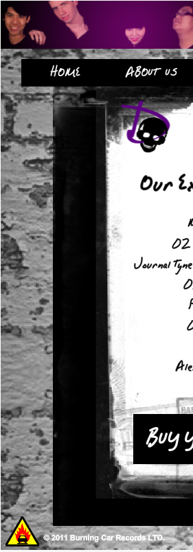
The theme of our products is rock and this is reflected in the music genre, which is rock, bordering on punk. Our music video follows many rock video conventions, such as extended focus on instruments and spotlighted high contrast lighting. Our album cover follows the conventions by having our song list grouped together in a block, as well as having a high contrast black and white front cover. Finally, our website ties it all together with a grungy, dirty brick wall background and a handwritten font for the adverts etc.

Further cementing the band identity are the colours. The overarching colour for the whole band is a deep, rich shade of purple, not too girly, but pretty strong and individual in its own right. The colour purple is presented in the album cover and website, mostly with the skull logo.


Purple is also the colour of Pandora, which signifies her as the lead singer, as purple is the most prevalent colour on everything. Aside from purple, we have three other colours to identify the other band members. Blue for Xen, Gold for Vyper and Silver for Sparks. These colours are shown on the website, on their individual biographies, as well as in the music video (though these are hard to see).


The band colours of black, white and purple are present throughout all our products. For the music video, black is the main costume colour, while we use white during the more 'innocent' scenes. On the website, the background is black and white, while purple streaks the page with text and titles. Our album cover has the same purple as the website and music video for the band name, while black and white feature strongly throughout the whole cover, especially on the front cover and back cover. Purple bars lie on the inside cover to tie the eyes together with the band.


Our website also helps to tie together all the products as well. The website has institutional and branding, for example, the Burning Car Records logo and theDropouts logo as well, as well as theDropouts skull on every page. There are also adverts for the album on almost every page and a large banner at the top of the page.


Also tying together the products is the music player on the website, which plays Goin' Down automatically, allowing fans to listen to the music without charge. In addition, there are links to the Twitter, Facebook and Tumblr of the band.


On the news page, there is also a live feed of the band's twitter page, allowing for fans to join the conversation, connecting the institutional aspects of the band on the internet.

We have also used the band logo (the skull) and the record label logo in our two ancillary texts, to create a furthur institutional identity. We had planned out a whole marketing scheme in order to promote the music video, using the website as a hub and the album cover as a teaser. On our website, we have a competition in partnership with Monster energy drink (Hansen Natural).

I decided to use Monster because it was less popular than something like Coca-Cola and more likely to be drunk by our target audience. It was incredibly unlikely that we would be able to get a partnership with Coca-Cola for a competition, even for an imaginary band, which is why Monster was my choice of beverage.


In the music video, the skull logo is taped to the bass drum, though it is only visible in a few shots. On the website, it is on the top left of every page, while the record label is on the bottom left and a link to the record website on the top banner.


Our band costumes also play a strong part in creating synergy between our products. The band members wear the same costume on the back cover of the album as they do in the music video, as well as in the photoshoot, which is shown on the gallery of the website. Their similar, yet unique outfits both group them together and set them apart, creating an identity that is both branded and individual.

0 comments: