

Our media product uses several conventions of its genre, as well as challenging common representations of women. We construct this through our costume design, character personality, use of theory to develop our video and so on. Particularly influential to our designs were The Pretty Reckless and Paramore. Completely unintentionally, we shared some of the ideas from one of Paramore's music videos 'Playing God', which we only found out after completing our own video.
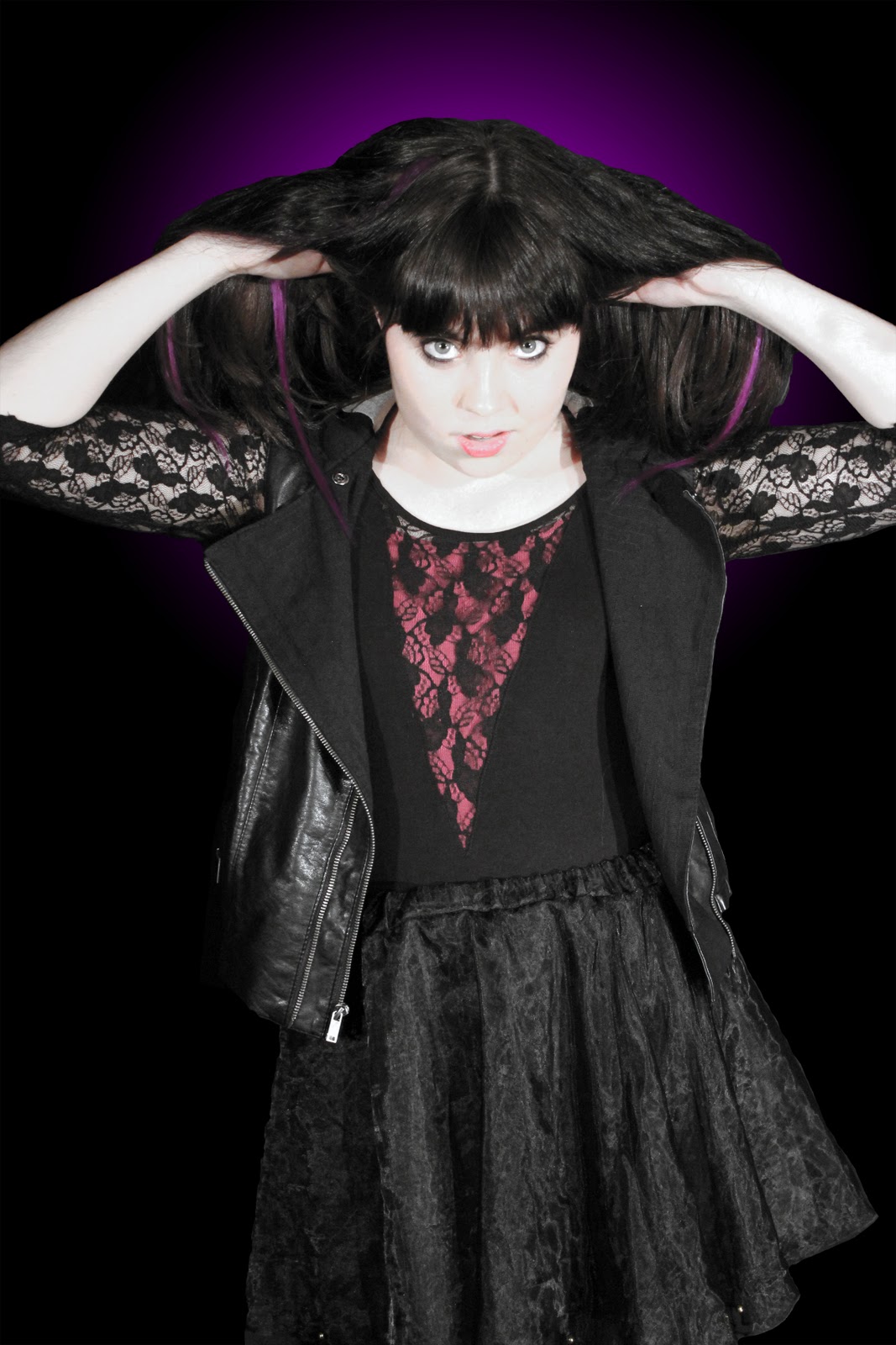
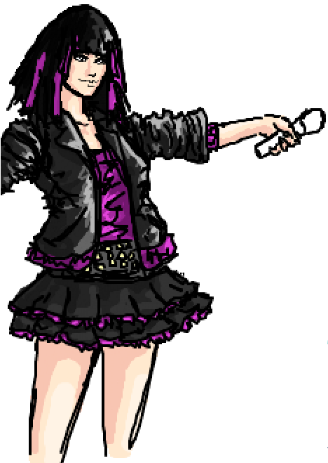
Our costumes were designed by me. From the very beginning, as soon as we had decided on our song and that our band was going to be fronted by a woman, we knew that we didn't want to present her as slutty or promiscious, and yet we wanted to show her as having beauty and strength. It was our plan to represent our lead singer as a role model/anti-role model for our target audience, someone to look up to as a symbol of female empowerment. I had attempted to design her character as a rebellious role model instead of what many women are represented as in the media; weak or promiscious.
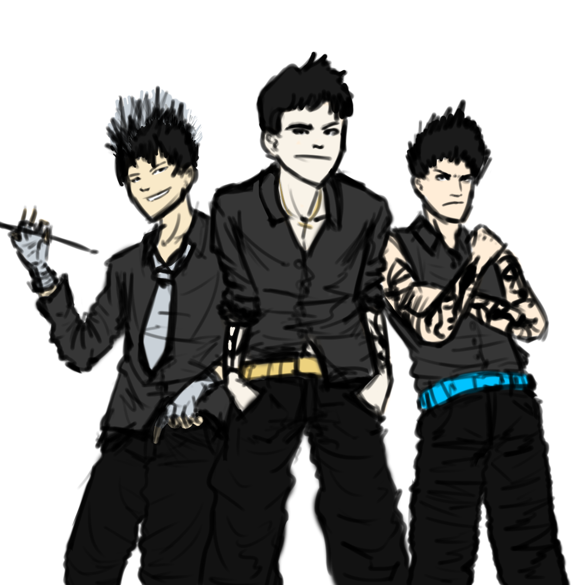
The designs I came up with for the band was more stereotypical for a rock band/rebellious look. When drawing them, each person had a distinct personality. The drummer was supposed to be the cool, suave one, the lead guitarist was supposed to be the handsome, sexy one and the bassist was supposed to be the macho one. The black tied them in with each other and with the singer, as they all wore black, but they all had a colour to differentiate them from each other, for example, the drummer had silver and the guitarist had gold. Due to actor concerns, two out of our three male band members had to be replaced. The bassist was replaced by myself and the drummer was replaced by a friend (Ming) who was willing to help.


The final character representation was different from what I had designed, due to the inate differences in personality. It would have been too forced, as Ming is too bubbly and happy to be suave and I just don't fit the macho mold. We instead created new personalities to fit our characters. I became the enigmatic Xen, supposedly an alien from another planet who simply appeared one day and Ming became the hyperactive, always happy drummer of the band.
We have also used media theory to good use, using Vernallis and Goodwin within our video, which is discussed below.
Following is many of the main points of the video summarised for question 1.

Here follows an analysis of the album cover.
Thus, as you have seen, my media product uses, develops and occasionally challenges forms and conventions of real media products.


0 comments:
Post a Comment