Linkin Park album covers are always interesting. The band is well known for its nu-metal and alternative rock songs. Their style of music is suggested through the album covers, for example, the first album cover, Hybrid Theory, consists of a soldier with dragonfly wings. The idea behind this was to describe the blending of hard and soft musical elements, contrasting the outstanding red soldier to the delicate, pale wings. The use of spray paint reflects the content of the songs; frayed, uneven and broken, like the themes of isolation, disappointment and relationship failure.

The second album, Reanimation, also has a related cover. The soldier from Hybrid Theory has been replaced by a robotic version that resembles a Mobile Suit Gundam from the Gundam Wing animé that became extremely popular in the U.S prior to the release of the album. The robot has connotations of a remixed album, as the songs are remixed versions of Hybrid Theory songs.

For the Meteora album cover, spray paint is again a common theme. The album contents reflect this, which is perhaps the reason that some critics have called it nothing more than Hybrid Theory part 2. This, however, makes it easier to brand as Linkin Park. They are already well known for their nu-metal/alternative rock songs due to Hybrid Theory, allowing LP to link Meteora back to that via the spray paint. In addition, the man doing the spray painting with a gas mask is a call back to one of the songs from Reanimation; Frgt 10 (Forgotten), the music video of which features a rebellious man spraying the LP logo onto a wall.

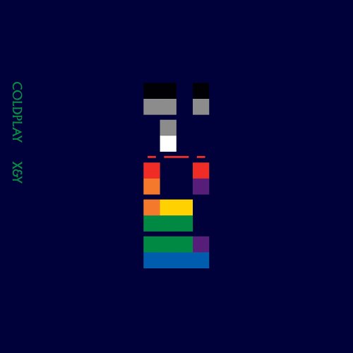
On the other hand, while Linkin Park often shows their band members on the cover of their albums, Coldplay is more of a conceptual band than Linkin Park, with their album covers reflecting their alternate nature, despite being classified as the same genre as Linkin Park. Coldplay's first two albums, Parachutes and X&Y have a cryptic album cover, mystifying the listener. The covers raise questions about the band that aren't immediately answered, which interests the listener and persuades them to buy the album to examine the band furthur. While Parachutes has no direct reference to the songs on the album, X&Y is named after the song X&Y on the album. None of Coldplay's albums feature the band on the covers, although Parachutes has the band on the back (albeit very small)


As a whole, album covers are designed to sell the album, to market them to the target audience. They are there to help promote the band image, in Coldplay's case, to promote an image of mystery and indie, in Linkin Park's, to sell the band as punky and edgy. The front cover sells the artist as a whole whereas the back cover is to sell the album itself, as well as having the institutional synergy (i.e, company information, company logo, barcode etc). The back cover also has a song list, with time codes and duration of the song.
Every album cover will have the title of the album, the name of the artist and a unique image to help market it. The size of the font will depend on how well known the artist is, if it's a debut album, the name of the band will overshadow the name of the album, with the band name shrinking in the later albums, as there is less need to emphasis the artist's name. The type of font used will usually reflect the artist's nature, for example, Linkin Park's font is quite grungy earlier on, reflecting the dark themes contained within, whilst Coldplay's font is relatively plain in the earlier albums, but becomes much more extravagent and eccentric in the later albums.


0 comments:
Post a Comment